Celebrating Print
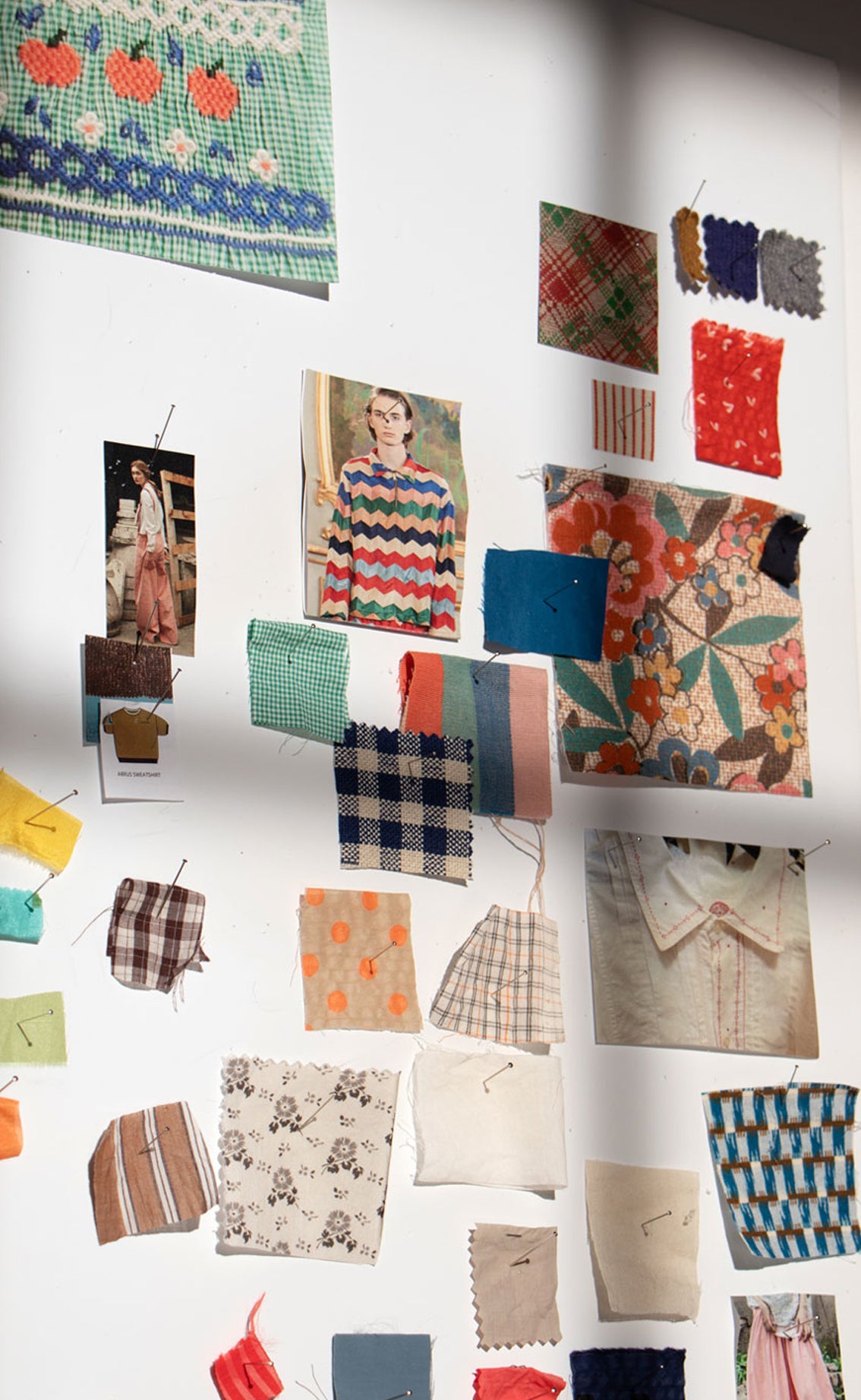
At Caramel we like nothing more than celebrating print. Caramel’s in-house print archives are rich with geometrics, graphic patterns, bold paisleys, ditsy florals or spriggy bouquets, something which we drawn on endlessly as we continue to explore how we might develop them further.

Our prints are always considered within the context of Caramel’s sophisticated (pleasingly off- colour palette) which imbues them with a sharp modernity.

Prints were of a huge consideration when Eva Karayiannis first decided to launch Caramel over twenty years ago.

“For me, prints are very much embedded in the English culture in terms of textiles -more so than in other countries. Europeans didn’t tend to wear prints: the Italians not so much and Greeks even less so- it is a much pared back, almost minimal style.”

For Karayiannis, prints were intrinsic to the British heritage. One only need think of Liberty ….and so she started to carefully consider how she would rework prints, giving them a different life (and colours) and figuring out how she would also make them her own.
“It was fascinating to explore how different a print becomes with a little bit of tweaking, how a different colour palette- ours at Caramel is sophisticated in its use of ‘off’ shades which are also paired in a mismatched fashion - can radically alter the style of it.

Karayiannis wonders if this is perhaps more indicative of a European sensibility. In many cases, such as working with a floral or bouquet print she will remove some of the prettiness and add an unexpected colour which lends the overall effect a sharp modernity.

It is a process she repeats: experimenting with colour combinations which are anomalous.

“A lot of the time, it is about removing the tweeness. I want to give it my own understanding and approach, something which probably sits between a romantic style coupled with a minimal Greek aesthetic.


